React and Material UI (MUI)
Jan 8, 2021
When I first used Material UI, I struggled with a few concepts. I've written this quick overview to help get my head around it, and hopefully guide others to a quicker start.
I'm going to make a new project and then create some (horrible) styles!
Create the project and add MUI
Create a project and install the Material UI package
1npx create-react-app material-ui-playground 1cd material-ui-playground 1yarn add @material-ui/core Clean up the initial templates
Remove some unused contents (import of the styles) from the index.js
1import React from 'react'; import ReactDOM from 'react-dom'; // import './index.css'; DELETE this line and the file import App from './App'; import reportWebVitals from './reportWebVitals'; ReactDOM.render( <React.StrictMode> <App /> </React.StrictMode>, document.getElementById('root') ); Replace the App.js content with the following:
1const App = () => { return ( <div> <h1>Material UI Playground</h1> </div> ); } export default App; Creating a theme
First we need to define a palette to work with - This will define the core color and tones of the UI.
Then we can use the palette to create a theme that we can use around the site. It's not just the color that can be in a theme, but also all other properties such as spacing and font-family.
In my example we will be using colors only. You can import the core colors from the mui package and use them. They come with a range of shades built. We can also specify light, dark and contrastText colors for our palette, but if we don't MUI will automagically do this for us.
1import { createMuiTheme } from '@material-ui/core/styles'; import { purple } from '@material-ui/core/colors'; import { amber } from '@material-ui/core/colors'; import { red } from '@material-ui/core/colors'; const theme = createMuiTheme({ palette: { primary: { main: purple["500"], // We don't need to set the text colour as MUI will work this out }, secondary: { main: amber["600"], // We will manually set the alternate colours light: amber["200"], dark: amber["900"], contrastText: '#222222' }, error: { main: red["500"] }, background: { default: '#fff', }, }, }); export default theme; Then in the App.js import the theme and theme provdier.
1import { ThemeProvider } from '@material-ui/styles'; import theme from "./theme"; // ... the rest Then wrap the returned DOM in a <ThemeProvider /> like so:
1// ... rest const App = () => { return ( <ThemeProvider theme={theme} > <div> <h1>Material UI Playground</h1> </div> </ThemeProvider> ); } export default App; Now the components within the ThemeProvider will all be able to use the theme we have just created. Let's use it.
We could just import the components directly into our App but to keep them nice and tidy (and reusable elsewhere) we will make a component!
Create a component components/TitleBlock.index.jsx. In this we will use the build in MUI Typography component. This takes a few props. We are going to set the varient to h1 so we get a <h1 /> rendered, and give it a color to use. This is one of our colors we set up in the theme palette.
We're also going to use a Divider which will create a <hr />.
1import Typography from "@material-ui/core/Typography"; import Divider from '@material-ui/core/Divider'; const TitleBlock = ({title}) => ( <> <Typography variant={"h1"} color={"primary"} >{title}</Typography> <Divider /> </> ) export default TitleBlock Now we can import it and use it in the App.js.
1import { ThemeProvider } from '@material-ui/styles'; import theme from "./theme"; import TitleBlock from "./Components/TitleBlock"; const App = () => { return ( <ThemeProvider theme={theme} > <TitleBlock title="Material UI Playground" /> </ThemeProvider> ); } export default App; You should see something like this:

Material UI contains a full set of built in components used to build a website from Layout to Forms.
There is the more core components like Typography, Container and Link.
Typographycomponent which we have just used which has a whole range of variants that allow all headings & paragraphs.- Layout components like
BoxandContainerfor building wrappers and containers. - Interactive components like
Linkreplace<a />tags
Then there are more bespoke components like Breadcrumb and Paper. These are prebuilt components that allow you to build the detail of your component more quickly in a uniform design language.
However if you find that there is a component that you need to build yourself, you are not just stuck with what is provided. There are also tools so that you can style your own components and create the styles for them.
Making styles
Styling is done using JSS. It's like CSS but done with JavaScript objects and the JavaScript names for properties (camelCase).
Styling child elements
We have created a theme and it can be used by the built in components, but what if we have some user generated content or there is some markup that you don't want to convert directly to use MUI components. This is where you can use styles.
Let's say we have the following:
1const UserContent = () => { return ( <div> <h3>I am a user comment</h3> <p>Here is a list:</p> <ul> <li>Point A</li> <li>Point 2</li> <li>Final point</li> <li>The end!</li> </ul> </div> ) } export default UserContent; 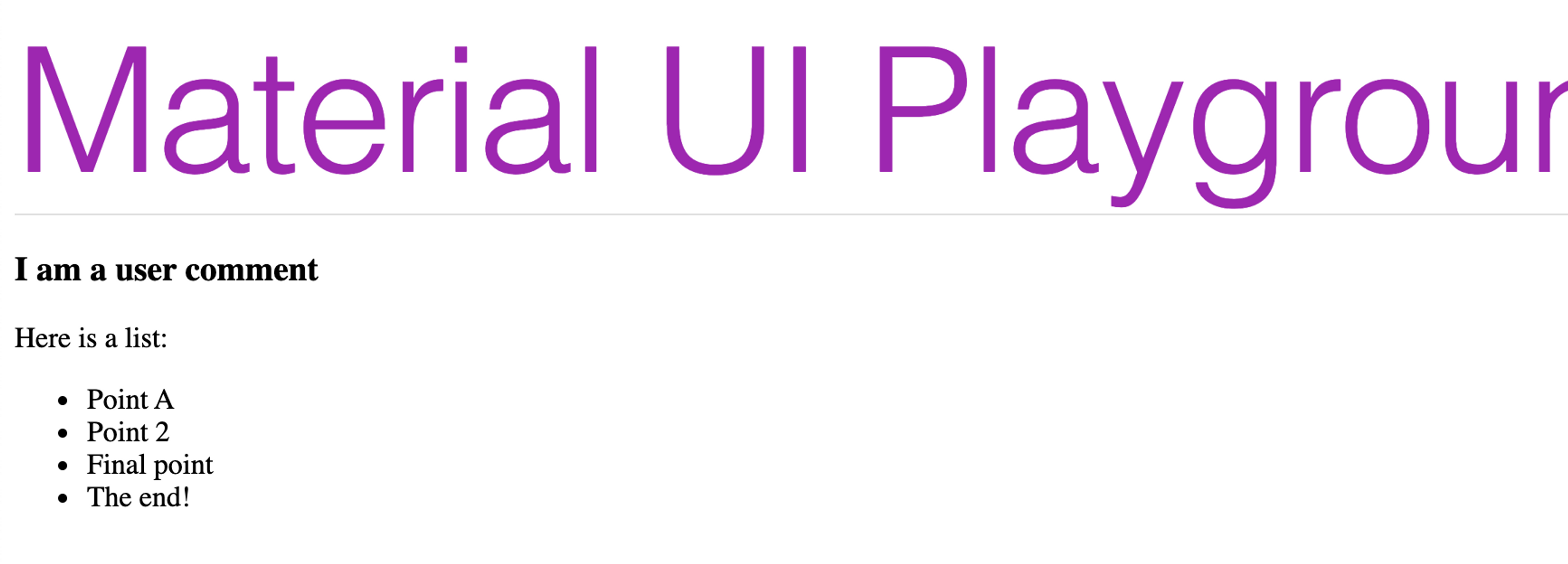
First we want to create some styles in the UserContent component:
1import makeStyles from "@material-ui/core/styles/makeStyles"; // Takes the theme we have used in the ThemeProvider const useStyles = makeStyles((theme) => ({ userContentStyles : { // Create a catch all style for all elements so we don't // need to create each HTML element // we use the body1 property which is for <p /> // the theme.typography.body1 is an object so this can be added straight on the key "& *": theme.typography.body1, // To style the <h3 /> we can create a style for it. "& h3": { // because we are using 2 properties in here we need to wrap them in braces. // We also have to spread the typography object. ...theme.typography.h3, // Then we can just apply the color using the theme's color object which is a string. color: theme.palette.secondary.main }, "& li": { // To apply some spacing to our list we could use some spacing properties marginBottom: theme.spacing(4) }, } })); // ... rest With the h3 element we have to spread the typography object because it contains things like font-sizes, line-height, weight etc. When it is the only value we're using for a key (eg & *) you don't need to spread it!
If you wanted to pick only certain aspects of the h3 typography object you could just pull out the values you need.
1"& h3": { fontWeight: theme.typography.body1.fontWeight, // pseudo code: Not sure these are the prop names! lineHeight: theme.typography.body1.lineHeight, // pseudo code: Not sure these are the prop names! // and so on! } With the palette properties we don't need to spread them because they are just a value so we can use it as is.
Now we can use the styles in the component itself.
1const UserContent = () => { // Then we get the created styles in the component const styles = useStyles() // Add them as a className. Note we use the "userContentStyles" key of the styles object return ( <div className={styles.userContentStyles}> <h3>I am a user comment</h3> <p>Here is a list:</p> <ul> <li>Point A</li> <li>Point 2</li> <li>Final point</li> <li>The end!</li> </ul> </div> ) } export default UserContent; 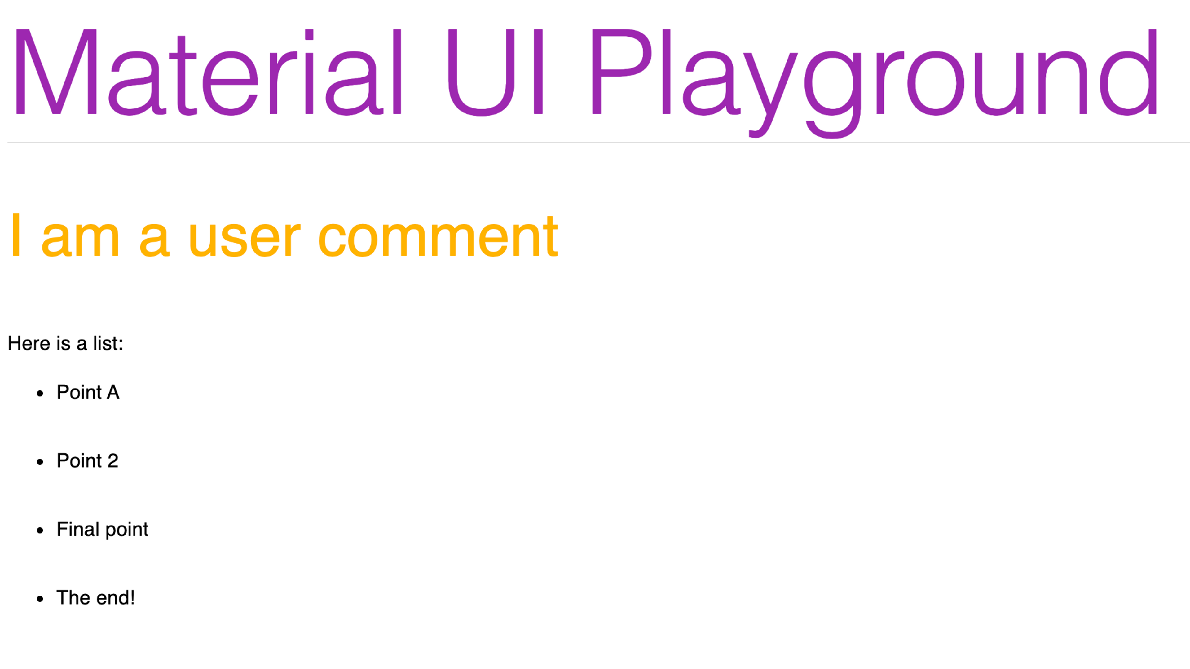
Note: I am making very obvious changes for illustrative purposes. My UI skills are better than the above design!
Classes for each element
The other way we can style child elements is using class names for all elements.
Make a new component Classy/index.jsx. First we import the makeStyles and use this to define a style function that uses the theme to return our styles.
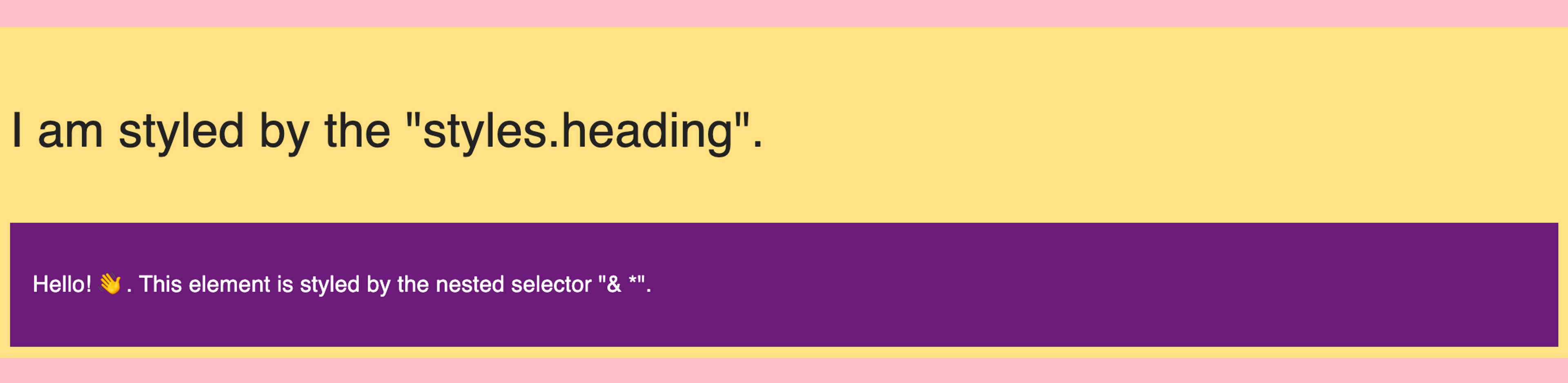
1import makeStyles from "@material-ui/core/styles/makeStyles"; // Takes the theme we have used in the ThemeProvider const useStyles = makeStyles((theme) => ({ // These keys will be used to define the classes for components/elements wrapper: { // set the properties using theme values padding: theme.spacing(1), background: theme.palette.secondary.light }, heading: { color: theme.palette.secondary.contrastText, ...theme.typography.h4, // spread objects }, content: { padding: theme.spacing(2), color: theme.palette.primary.contrastText, background: theme.palette.primary.dark, // We can also target nested children as per the other example "& *": theme.typography.body1, } })); // ..rest In the above example the wrapper, heading and content are all going to be propeties of the style object we create so we can then use them as our classes. We do this by creating the style object in the component as styles and then we can use styles.PROPRTY_NAME to use the className that the JSS/makeStyles has created for us, like so:
You should have noticed that we have mixed both classes on multiple components (styles.WHATEVER), and child component styling (& *). That gives us great flexibility to style what we need.
1const Classy = () => { // Create the styles object const styles = useStyles() // Then use the keys we created above to apply the classes to the right elements return ( <div className={styles.wrapper}> <h4 className={styles.heading}>I am styled by the "styles.heading".</h4> <div className={styles.content}> <p>Hello! 👋. This element is styled by the nested selector "& *".</p> </div> </div> ) } export default Classy; Import it into your App.js and add it to the component and you should see something like this:
That covers child components, but what about global elements!
Global styles
So far we have seen how to style components and their descendants. But what about if you need to apply style to the html or body?
In this case you still create a component, however you can style Global elements by creating a @global style. Anything within this is applied to the the root and becomes global. Within this you can add your selectors such as body and apply the styles you need.
Note: By default, MUI already has normalised styles applied to elements to keep all browsers consistent.
1import withStyles from "@material-ui/core/styles/withStyles"; const GlobalCss = withStyles({ '@global': { // Declare a @global selector in order for jss to pull out the styles "html, body": { // create your styles to apply globally margin: 0, padding: 0, backgroundColor: "#pink" }, }, })(() => null); export default GlobalCss; Then import and use it in your App:
1import { ThemeProvider } from '@material-ui/styles'; import theme from "./theme"; import TitleBlock from "./Components/TitleBlock"; import UserContent from "./Components/UserContent"; import GlobalCss from "./Components/GlobalCSS"; const App = () => { return ( <> <GlobalCss /> <ThemeProvider theme={theme} > <TitleBlock title="Material UI Playground" /> <UserContent /> </ThemeProvider> </> ); } export default App; 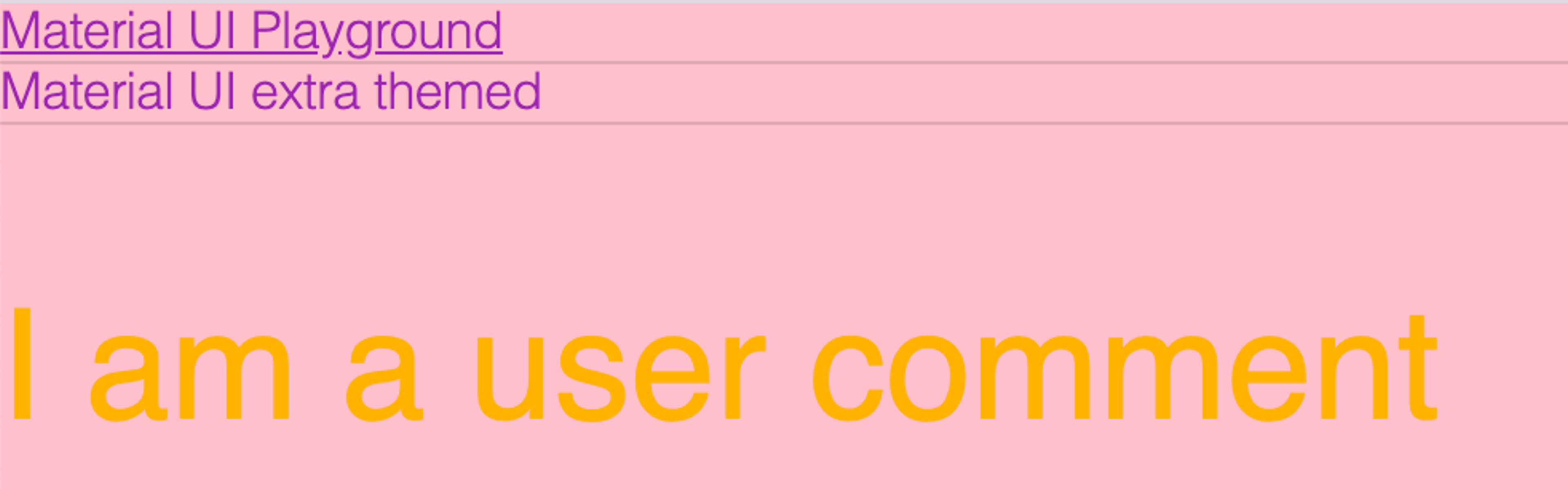
You can also create global styles for the MUI component classNames in the GlobalCSS.
1const GlobalCss = withStyles({ '@global': { // Declare a @global selector in order for jss to pull out the styles "html, body": { // create your styles to apply globally margin: 0, padding: 0, backgroundColor: "pink" }, // Target the MUI class ".MuiTypography-h1": { textDecoration: "underline" // A silly style to make a point! } }, })(() => null); export default GlobalCss; 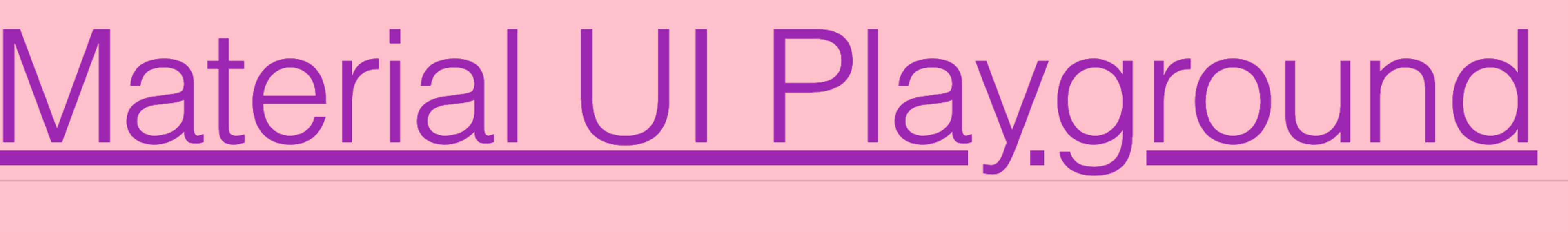
Nested themes
With nested themes you need to target classes via the more generic [class*="MuiTypography-h1"] if you wish to style all of an element.
The[class*="CLASSNAME"]selector selects all classes that contain a value ofCLASSNAME.
We need to use this because the nested theme class names change from MuiTypography-h1 to MuiTypography-h1-9999 where 9999 is a unique theme number! We are selecting all classes that contains MuiTypography-h1.
1const GlobalCss = withStyles({ '@global': { // ... the rest ".MuiTypography-h1": { // only targets the to level / single theme textDecoration: "underline" }, '[class*="MuiTypography-h1"]': { // Targets all themes due to selector fontSize: "1em" } }, })(() => null); I am using the same theme twice just to demo the class name changes, but you would use a secondary theme in the real world™️!
1<ThemeProvider theme={theme} > // Top level theme <TitleBlock title="Material UI Playground" /> // uses only top level theme <ThemeProvider theme={theme} > // Nested theme <TitleBlock title="Material UI extra themed" /> // Uses nested theme overides and top level theme <UserContent /> </ThemeProvider> </ThemeProvider> The end!
And there you have it. You can now style everything from the built in components, through to nested child components and global styles too.